Sneak Peak! Page 1 of Issue #3
An early look at Issue #3, to be released July 7/10... This is a behind-the-scenes look at the art process behind our first page of the third issue, from the layout stage to the inking stage to the colouring stage. It's a very fascinating process that takes a lot of work - from the scripting to the final product.And yes, that's Falstaff in the bottom panel of the page... You will enjoy his presence in this issue!...
Preview art for Issue #3...
Although the release date is over a month away, and also that people are still focused on Issue #2, I thought that we'd publish the official Previews ad for Kill Shakespeare Issue #3... This is the ad that featured in the May issue of Previews magazine (the catalogue that all comic book shops order from) and we've gotten a lot of good reaction from it. The cover is great (by Kagan McLeod) and the issue was a lot of fun to work on.
Two More Preview Pages from Issue #2...
With the release of Kill Shakespeare #2 tomorrow (May 19th) we wanted to post some more pages online to whet everyone's appetites... These two pages are from a scene in which Hamlet is attacked by an assassin (one page reveals the identity of one of the assassins) and he has to flee. Great artwork by Andy Belanger and colouring by Ian Herring.
Previews of Additional Issue #2 Pages...
Here are previews of four more pages from Issue #2 (released May 19/10)...This first page features a band of rebels called the Prodigals attacking Richard III, Hamlet and Iago... This next page (page 9) has Richard trying to protect Hamlet from the Prodigals, the rebellious group that are out to fight on behalf of William Shakespeare.
This next page (page 16) features Hamlet and an unnamed figure hiding from an assassin out to kill Hamlet...
 And this next page (page 20) features Richard flexing his muscle when one of his soldiers fails him...
Yes, there's a lot of action in this issue.
A Preview on aintitcool.com!
As someone who reads up as much information about film and television (non-reality, of course), aintitcool.com has been a big source for me over the years. Since starting the project I have started to rely on the site more for comic news and previews - they always run a preview page on Mondays and then do reviews / critiques on Thursdays. They also put together a pretty good "Best of the Decade" section in December/January, with some titles I have subsequently read because of it.
 Kill Shakespeare received a preview posting yesterday (Monday), which is a BIG thing for us! Especially for our artist Andy, who has wanted to have one of his titles on the site for years. So we're all pretty happy with this preview!
This should be on the side of a rock band van...
Here is another preview of the process behind Kill Shakespeare. Page 14 of Issue #1 was a fun page for us to watch as it moved from thumbnails to final colours. We left it open for artist Andy Belanger to work his magic and he came back with something pretty psychedelic, colourful - and something that could appear on the side of a Grateful Dead van...
Kudos to Andy B and Ian Herring for some great work on this page. This page was previewed in a recent article on ComicBookResources.
Issue #1, Page 2 - From Thumbnails to Final Colours
Many people that we speak to are fascinated by the artistic process behind the creation of a comic book. As we move forward we'd like to shed some light into said process for everyone, using our first issue as an example.
Step 1: The Thumbnails
After reading through the script, artist Andy Belanger interprets the story and roughly sketches out what the panels will look like and what will happen. This is very rough and mainly focuses on the action and the placement of the characters and any lettering/word bubbles.
Step 2: The Penciling and Inking
Andy will then pencil the panels in detail, focusing on the characters and backgrounds. For this particular series Andy is placing a great deal of emphasis upon the backgrounds for each panel, as evidenced on this page. He then goes through the page and inks it - places the shadows, emphasis on the lines, etc.
Step 3: The Colouring
Our colourist Ian Herring now takes over and takes a scanned copy of the penciled and inked page and, using Adobe Photoshop, adds colour to the page.
All in, this is a very labor-intensive process. As you can see with these results, though, it's well worth it!
Official Previews Ad is Released
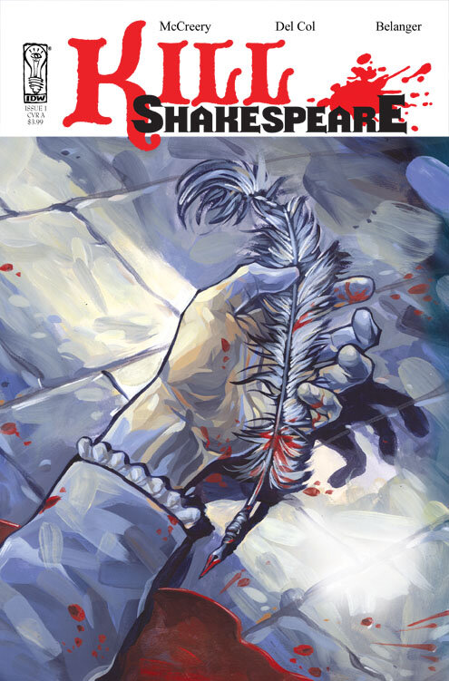
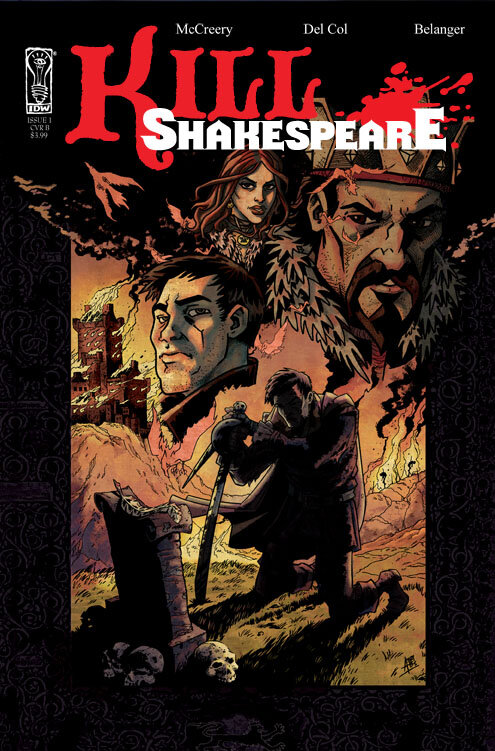
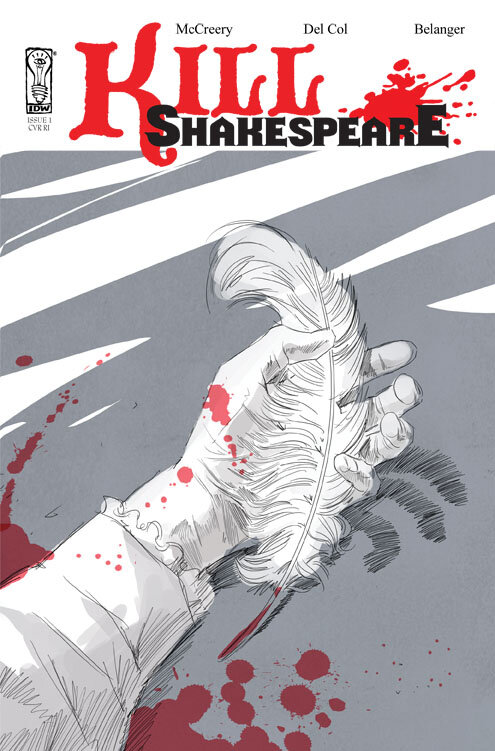
The official Previews ad for the first issue of KILL SHAKESPEARE, which is released to comic book retailers throughout North America, has been released this past week. Featuring artwork by Andy Belanger and cover artist Kagan McLeod, the ad displays the two covers available for the first issue as well two pages from the book.
When I first received this artwork I got an immediate call from artist Andy B, telling us how excited he was to see it. Even Conor, who will admit that he often doesn't take the time to celebrate milestones properly, became super-excited about the upcoming release when he first looked at it.
The logo is a temporary one - we've just finished work on a revised version that is exciting everyone in Andy B's studio. The design of the ad was created by the inhouse team at IDW Publishing. Thanks to our editor Tom Waltz and IDW E-I-C Chris Ryall for overseeing this. (And for those that might catch them, I'm not sure who to blame for the punctuation errors... normally I blame Conor but I'm not sure about it this time...)
For those that don't know, Previews is the monthly catalogue/listing of all titles that are available to be stocked. The February issue highlights those that will be released in April.
For retailers, the ad is on Page 263 and the Ordering Code is #FEB10 0959.


